Labels
A. Main Task: finished products
(3)
B. Evaluation: forms and conventions
(4)
C. Evaluation: representation
(1)
D. Evaluation: institutions
(1)
E: Evaluation: target audience
(1)
F. Evaluation: addressing my audience
(1)
G. Evaluation: technologies
(1)
H. Evaluation: skills development
(1)
I. Appendix: main task planning work
(4)
J. Preliminary Task: finished products
(1)
K. Preliminary Task: planning materials
(1)
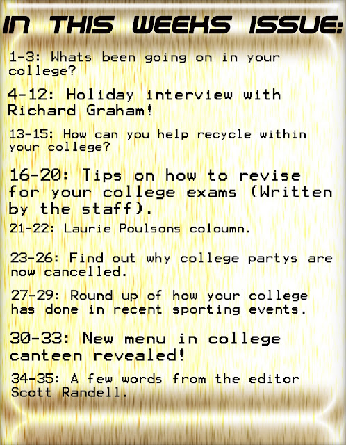
As you can see i have come along way in my final contents page in correlation to my preliminary task contents page. By looking at my first contents page it doesn't take a genius to work out that i wasn't very good at photo shop at all at this point in time. As you can see i have no images on the page and there is little color on the page as well. In contrast to my Final contents page they are almost like binary oppositions of one another. The preliminary task contents page is very simple and seems to have little thought put into it whereas the Final task contents page seems very professional i feel and more structured. From an audiences point of view i know for a fact they would much rather read my Final task contents page as apposed to this because its just much more in depth and eye catchy and altogether a better product.
Who would be the audience for your media product?
Demographic Profile
- Gender 55% Male 45% Female
- Status Student/Single
- Social Status B,C,C1,D
Psycho Graphic Profile
- Individuals
- Inspirations
Taste in Music
- Rock
- Soul
- Indie
- Mellow-DnB
Clothing
- ASOS shopper
- Topman
- Fashionable
- Converse Allstars/Adidas
Selling points for my magazine
- A different magazine unlike many others(Diversity).
- Exclusive interviews with the hottest and latest bands and soloists.
- Reviews of all the latest hit albums.
- Chances to win big prizes on a regular basis.
What have i learnt since starting my music magazine.
 I've learn't so much since i started my music magazine all those months ago and i feel i have come so far from being virtually useless on photo shop to being relatively good now. Before media i had some experiences with other programmes such as iMovie and Final Cut Pro on Macs, but my windows knowledge of programmes was fairly limited in my understanding of them. So when i was introduced to photo shop i found it hard and over complicated to begin with but the more i tried and experimented the more i came along as a media student and the more daring i got with my final product. Blogger was also new for me i hadn't used a website like it before in my life, i wasn't even aware it existed until media. So that was also new and hard to navigate around, but like with photo shop the more i used it the better i became and using it. Altogether i would say that learning how to use photo shop has been great for me as it is a skill i am happy i have learnt and i feel confident to tackle more tasks that would involve photo shop.
 Questionnaire:
We designed a questionnaire to discover what people think about the college magazine. Our research into the college magazine has shown us clear findings. I was shocked when we discovered that only 5% of people in college actually read the magazine. Obviously the magazine isn't reaching out to the target audience. I think that the college magazine should include news/events, jobs, fashion and sports seeing as they are the suggestions are audience have given us. The general consensus for price was 50p as 70% of people said this was a reasonable price. Roughly 90% of people said that interesting articles would be good features in the magazine and would encourage students to buy it. People also seemed to want a subject information page, maybe the magazine could include weekly updates and information on each subject. When we asked people if they would subscribe to the magazine 80% of people said no. So maybe the magazine could do a deal with the consumer that is something like if you liked the first 3 magazines we will give you 2 months free subscription, or something along those lines. The majority of people also wanted the product to be monthly not weekly or every fortnight, so the publishers should acknowledge this and try to meet these requests. Finally virtually all the people we interviewed said that they never even knew there was a college magazine, so how could they buy it if they didn't know it existed. So the publishers defiantly need to advertise it more and make it known to students that it exists.
College Magazine Review:
The majority of college magazines seem to be very student orientated, for example they have students on the front covers of the magazines and advertise products and events which appeal to that age group of students. The color schemes for these magazines are very simple they use a maximum of 4 colors and they use text which is exciting and eye catchy. It also seems that most of these magazines have been made by students and obviously for students, this isn't abnormal because students surely have a better idea of what their own age group want to see than anyone else right? The magazines seem very modern with art on the front of them, this art though doesn't just appeal to art students but all students because its interesting and abstract. The majority of these magazines have one main image and a few subordinate images that are smaller. The magazines language used seems jokey and cool, the magazines don't seem to serious. The target audience is obviously students male and female and aged between 16-21, and id guess the classes its aimed at are A B C1 C2.
In what ways does your media product use, develop or challenge forms and conventions of real media products?
Conventions are ways that magazines are constructed to look and read in a certain way. For example cosmopolitan is a woman's magazine and has pictures of women on the front, it would go against conventions if it didn't have women on the front because its seen as a woman's magazine, you wouldn't expected to see men with tons of make-up on the front of cosmopolitan. So by breaking conventions you have to go against stereotypes and argue that they cease to exist in your magazine. A magazine that has stereotypical conventions is Kerrang! most people think that people who read Kerrang! are Emo's and Goth's this isn't necessarily true at all, i read Kerrang! and i wouldn't consider myself an Emo or a Goth.
Conventions also has to do with the ways in which a magazine is set out and how they choose they fonts and pictures for each weeks issue. I followed most layout techniques that most magazines used, for example i had a masthead and a main image. These were all essentials for my magazine.So firstly when i started my contents page I wanted to give it a college feel, so i made the background on photo shop using some effects which gave it an wooden chrome effect. After researching numerous magazines I thought that the best title for a contents page was "In this weeks issue", this was because i felt it sounded better than anything else and it was clear and established what the page was about. The topics that i made up were based on what people said they would like to see in the questionnaires that we carried out. People asked for interesting topics, so one i was particular fond of was the "Why are college party's now canceled" i thought this was a topic which students would like to know the answer to as it is still very unclear to most students. I then changed the fonts size of the topics to bigger or smaller depending on how important i thought the topic was so the more important the bigger font it got and the less important the smaller font it got. I think my contents page needed more images on because when i look back it seems very boring and contains to much writing, a fair share of writing and pictures is needed.

The image that i used for my front cover is a picture of my friend Richard, i took it whilst we were on holiday in Turkey, i wanted him to look astonished at his surroundings. To get these surroundings we traveled up a mountain and to these ruins and we found the perfect setting for the photo. I also took pictures of him lazying round the pool but felt this image was more suitable as it was more cultural than just him laying by a pool. The title for the magazine was simple i just called it the official magazine of the college, and i chose yellow for the font as its the main color for our college logo. The two texts displayed on the front cover were the two that i thought would interested the reader the most, so the holiday story was obviously linked with the front cover image and the other text was to do with college news. I kept the color scheme simple and only used 3 colors black, green and yellow, i didn't want to make the page to busy. I also added a recycling image down the bottom left i thought this was good because recycle is good for the environment and college should encourage these values to their students. Finally i added the price of the magazine, i came up with the price using the research that we gained by doing our questionnaires and most people said that they would buy the magazine for 50p.
Initial Ideas/Props setting and location report:
IPC Media produces over 60 iconic media brands, with print alone reaching almost two thirds of UK women and 42% of UK men – almost 26 million UK adults – while our websites collectively reach over 14 million users every month. IPC's diverse print and digital portfolio offers something for everyone, with a focus on three core audiences: men, mass market women and upmarket women. Our men's portfolio (IPC Inspire) comprises a wealth of leisure brands including Country Life, Horse & Hound, Rugby World and Decanter, as well as lifestyle brands including Nuts, Mousebreaker and NME. Our mass market woman's division (IPC Connect) comprises famous woman's weeklies including Look, Now, Chat and Woman; TV entertainment brands including What's on TV, TVTimes and TV & Satellite Week and, online, the GoodToKnow network. Our upmarket woman's division (IPC Southbank) comprises luxury fashion brands including Marie Claire and InStyle, lifestyle brands including woman&home and essentials and home interest brands including Ideal Home, Livingetc and housetohome.
The information above is about a website called IPC which basically promotes and produces mass media products. It sells and reaches out to a whole variety of different people. Notice it says Horse & Hound and Nuts those two brand are at two different ends of the spectrum, nuts is very male orientated and working class whereas Horse & Hound is aimed at upper class males who have money to blow. The two women markets are very stereotypical in the topics they have to offer. Most of the media products are aimed at women and them being interested in chat shows and living products. Which again comes back to this view that women are still seen as the housewife and don't care about issues such as politics because they are only interested in celebs and looking good. This site could be seen as stereotypical against women because they are offering such a specific market to them. But the same could be said about the male market, it depends how you look at it. The reason why the website aims these markets so specifically is because they know that men and women will buy into this idea.
Kerrang! Front Cover:
Kerrang! is a music magazine which is very popular in rock and punk music, its known for its exclusive interviews and its special monthly editions. The image on the front is very stereotypical of Kerrang! they always use an image which is bold clear and is also easy for the reader to distinguish who the band are. The front cover contains around 4 images, all of bands posing. The main image is of Linkin Park a well known band, the image takes up the majority of the page with a few subordinate images around it. The color scheme consists of Black, White, Red and Yellow, these colors are typical of most music magazines, they are bold colors and they catch the readers eyes. Typically most magazines won't use more than 5 colors, this is because they don't want to make the front cover to busy and in your face. The price of the magazine is £5.99 but this is because its a legends edition of Kerrang, usually they are only about £3.99. The magazine is appealing to the target audience which is 17-30 and the class bracket they aim at is A B C1 C2.
NME Front Cover:

Subscribe to:
Comments (Atom)


