My magazine is written in a style which is informal and relatively easy to read. If i had to compare my magazine writing style to another magazine's writing style i would say mine is similar to 'Classic Rock'. I say this because 'Classic Rock' is written well but its easy to understand the gist of the interviews and the topics talked about. The reader can interpret the style in which the my magazine is written in very clearly because i identified my target audience as being fairly clever and interested in reading lengths of writing.
People would want to read and be associated with my magazine because it isn't similar to many other magazine and being unique is important to most people. My magazine entices people to read it because it has a new feeling to it and people always feel that they need to try new things. The aim of my magazine was to attract readers who might not have a magazine to read because the style in which they like to see and read doesn't exist, but i hope my magazine changes this view and those people come and read my magazine because it fulfills these needs.
Scott Randell's AS Media Blog
Labels
A. Main Task: finished products
(3)
B. Evaluation: forms and conventions
(4)
C. Evaluation: representation
(1)
D. Evaluation: institutions
(1)
E: Evaluation: target audience
(1)
F. Evaluation: addressing my audience
(1)
G. Evaluation: technologies
(1)
H. Evaluation: skills development
(1)
I. Appendix: main task planning work
(4)
J. Preliminary Task: finished products
(1)
K. Preliminary Task: planning materials
(1)

I chose this picture because its similar to the photo that i took for my front cover, the Arctic Monkeys album cover gave me the idea of what i would take for my front cover. In my picture my model was looking into the camera, exactly the same as the model was in the Arctic Monkeys album cover. The shot type i used was a close up, this shot allowed me to show the viewer my model's feelings and emotions very clearly. I asked my model to bend his head slightly because i wanted him to seem not bothered and unfazed by the camera. The more i look at this picture the more apparent it becomes to me that my model captures the essence of my magazine perfectly, that image is 'Cool'.

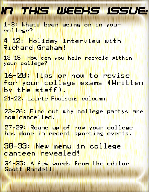
As you can see i have come along way in my final contents page in correlation to my preliminary task contents page. By looking at my first contents page it doesn't take a genius to work out that i wasn't very good at photo shop at all at this point in time. As you can see i have no images on the page and there is little color on the page as well. In contrast to my Final contents page they are almost like binary oppositions of one another. The preliminary task contents page is very simple and seems to have little thought put into it whereas the Final task contents page seems very professional i feel and more structured. From an audiences point of view i know for a fact they would much rather read my Final task contents page as apposed to this because its just much more in depth and eye catchy and altogether a better product.
Who would be the audience for your media product?
Demographic Profile
- Gender 55% Male 45% Female
- Status Student/Single
- Social Status B,C,C1,D
Psycho Graphic Profile
- Individuals
- Inspirations
Taste in Music
- Rock
- Soul
- Indie
- Mellow-DnB
Clothing
- ASOS shopper
- Topman
- Fashionable
- Converse Allstars/Adidas
Selling points for my magazine
- A different magazine unlike many others(Diversity).
- Exclusive interviews with the hottest and latest bands and soloists.
- Reviews of all the latest hit albums.
- Chances to win big prizes on a regular basis.
Subscribe to:
Comments (Atom)


